BITZ CO.
–Hand-Lettering
–Print Production
–Packing + Shipping
–Direct Sales + Communication
–Web design
–Social Media
–Art Directing
–Product Photography
–Email Campaigns
–Overall brand aesthetic
Bitz Co. was created for fun, but it started out a little less-fun. I was having a hard time and wanted to create some really crude + sassy stuff. Bitz was a play on the word, b*tch… using the z like ZsaZsa Gabor. Once my mind started clearing up, I realized positivity was much more effective and ran with it. It became a joyful representation of everything I love: seventies! warm colors! vegetables! nashville! women!
The logo was inspired by a couple of funky vintage fonts, then lettered to make it my own.
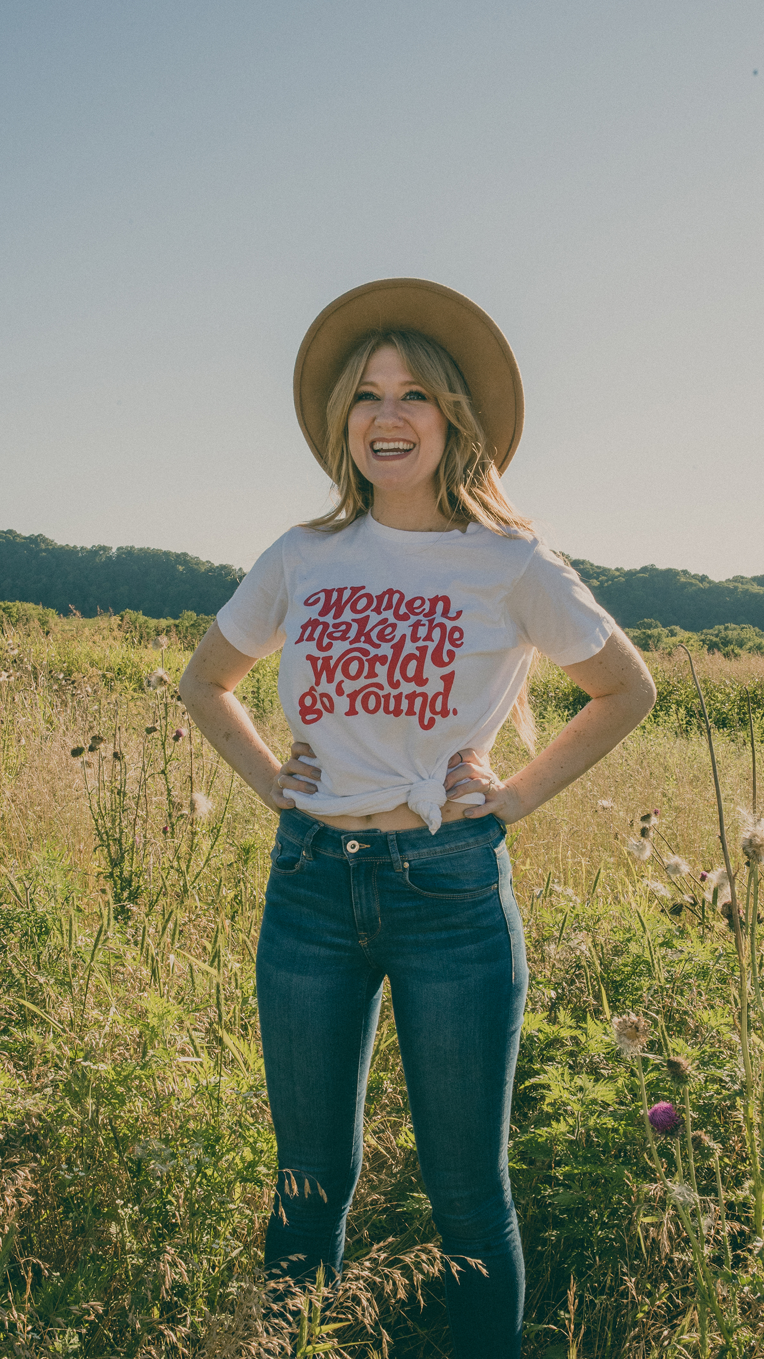
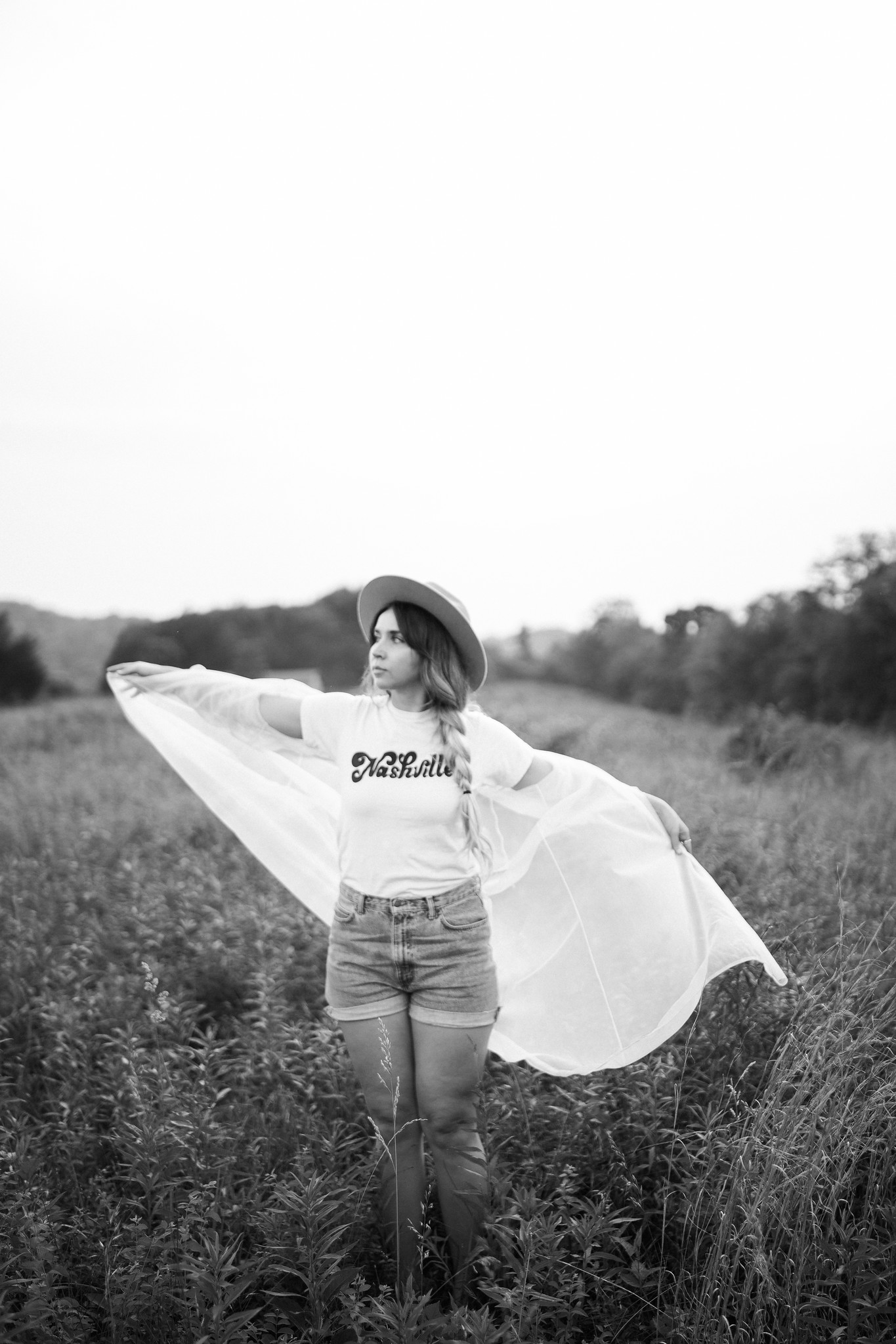
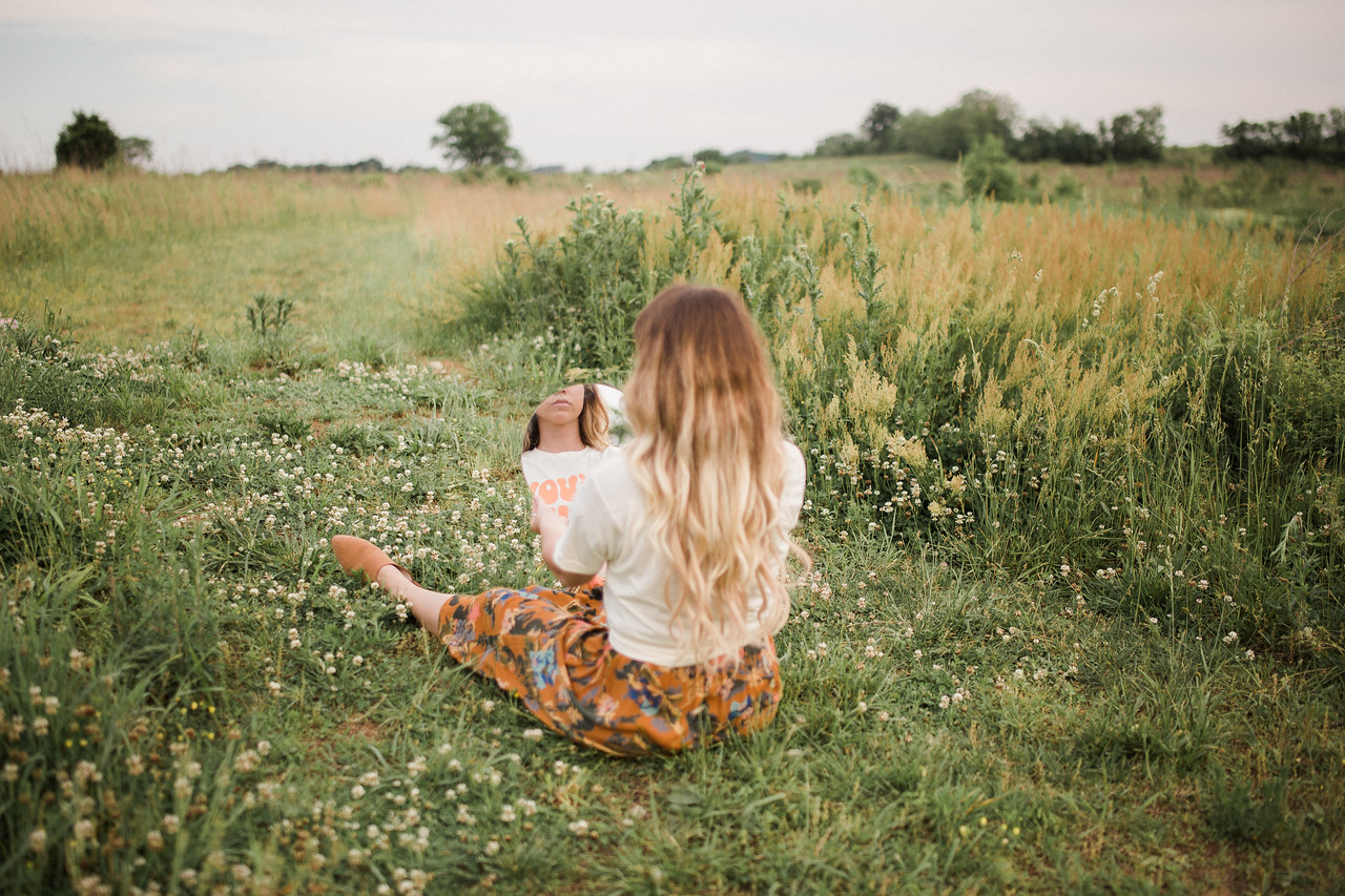
All images were intended to feel grainy and warm, evoking summertime feelings.
Women make the world go ‘round.
A nice reminder for anyone born to a woman.
Nashville
For the locals.
Mama Lion
For fierce, loyal, hardworking mamas.
Lion Cub
For boys and girls who love to be loved by their mama.
You’re Hot.
For when you look in the mirror.
Veggies
For anyone on Team Veggies.


